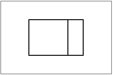
Figure 1. A web-page divided into two or more view ports (frames). Here defined as first order parallelism. On the left a permanent part with a do- or experiment- environment; on the right a permanent part with instruction and possibly scrolling.
By Rik Min
University of Twente (UT);
Centre for Telematics and Information Technology (CTIT);
Faculteit der Gedragswetenschappen (GW);
(Faculty of Educational Science and Technology: EDTE);
(Faculteit der Toegepaste Onderwijskunde: TO);
Department of Educational Instrumentation Technology (ISM);
(Vakgroep/afdeling Eduactieve Instrumentatietechnologie: ISM)
Not published until now.
Certain software and tools are used for 4 to 8 years at a stretch. However, there is also software that is only used once or very briefly, educative software for instance. Some educative software is only used for an hour or one afternoon. therefore it should have excellent interface. This applies to all digital learning tools. This article discusses dimensioning of educative software and digital learning tools like simulation. But it also applies to software in general.
Children or young adults often use educative software only briefly to see or experience something. For example in educative learning environments, based on simulations of phenomena called 'model driven simulations' (Min, 2001). Nowadays, educative software is just a series of interactive dynamic websites containing all kinds of applets, discover environments, instruction or Flash animation. This is called e-Learning. Environments for e-Learning on the web should be very carefully constructed, so that everything it contains will actually appear in the short time available.
This article holds a plea for the application of the parallelism concept in screen use (Min 1994). Theoretical backgrounds will be established in order to clarify the concept. Our short term memory limits our possibilities. Also a few theoretical insights from cognitive psychology will be mentioned such as the Split Attention Theory (Mousavi, Low & Sweller, 1995), the Cognitive Load Theory (Sweller, 1994) and in particular the Parallel Instruction Theory (Min 1992 and 1994) [8] [9]. These may supply a possible explanation why users need this concept and these ideas (Claessens, Monen & Min, 2000) [1] [2] [3].
Every designer of digital learning tools knows that a student will use a lesson or simulation task only once a year. In such cases software should be clear. Besides, youngsters do not like reading instructions or manuals. One afternoon of playing and learning with an educative application usually suffices. Usually, someone can not be trained beforehand, training, working and learning should all occur simultaneously and therefore software should be clear.
This situation is the same with games, but they are often played for longer periods than time spent on learning with learning tools. When a student is presented with a nice physics demonstration he should immediately be able to work with it. Pupils want to turn switches on or off, they should see useful assignments and have good coaching. Consequently, in an educative application nothing should be lacking in respect of design or ergonomics. Instruction and information should be clear and there must be sufficient time to read it. Other parts that are also related to the assignment must not disappear. This is the problem with most software and in particular with hypermedia. However, there are no average users, and that is what makes it so complex. Below are a few characteristic examples of parallelism or the lack of it.
Example 1
If you have seen the price of a pair of shoes on a site, by the time you have clicked to the next page, you have forgotten how much they were. The same applies to websites for travel. When learning in learning environments, it is essential that certain facts remain on the screen. Otherwise it is impossible to compare. Sweller's 'Split Attention theory' is very clear on this (Chandler & Sweller, 1991) [2]; as well as Min's 'PI-theory' (Min, 1992) [1]. If, technically speaking, it is impossible to compare two things, software for learning is doomed.
Anyone who has given a presentation knows, consciously or unconsciously, what parallelism entails. Below are two good examples.
Example 2
If a speaker is not working with a sheet on a beamer, he is writing on a board to illustrate a calculation for instance. So the sheet is on the projector and the sum is on the board. Now students can compare, the assignment on the beamer and the results on the board.
Example 3
It is a wellknown fact that students hate it when a lecturer is standing between the beamer and the sheets he is discussing. The reason is obvious: the images illustrate what he says. That is the reason for having sheets or slides at all. If you stand before the image it is hard to follow the drift of the story. The audience becomes annoyed. For they find it hard to get the point without proper parallel images. This simple example proves the value of parallel instruction or information.
Example 4
A modern chip-card as black box: when I pay for my lunch in our canteen at my university, I always forget the total amount of money still left on my card. And if I haven't enough money - next day - to pay for lunch again, it is because I always forget the total in euro's and because there isn't a parallel window with the balance. Too stupid? My poor memory? No, there isn't any parallel information on chip-cards! The cognitive load is too big for many people; like me.
These four examples show the essence of comparing when you do something, whether it is work or an assignment. There are many of these 'split attention' situations in the world of educative software. The viewer or user has to be able to solve his problem (here to make a choice or to understand the point of a speech). It is essential to have two or more sources of information parallel to each other.
From a scientific point of view one can determine an optimum in information streams and the space they take up. For instance how far two items are apart on a pc screen or what is the position of the speaker in respect op the overhead projector and the beamer in a lecture room. It is clear that with too much parallel information 'information overload' will occur, and on the other hand, with false information streams users won't learn or understand anything. The 'Split Attention theory', 'Cognitive Load theory' and 'Dual Code theory' as well as 'Parallel Instruction Theory' may help in this respect [4] [5] [8] [9]. The most popular solution to prevent serious cognitive overload with the user because he has so much to remember, is the application of different viewports. These are called 'frames'. But instruction or information on paper, parallel to a 'problem' on the screen, works very well. See figure 1.

The point is: who prefers what and which kind of information, auditively coded, or visually or both in parallel? For instance: is animation useful to explain something or is it sufficient to have an auditive or plain written textual explanation? What are the conditions under which certain users work better? Are there indeed differences between people who have an auditive or visual disposition? Between people who like typing and those who only want to drag and drop because they don't want to or can't remember certain commands?
Before the advent of the computer, monitors were used to transfer information or to instruct the viewer. With the arrival of the personal computer, monitors got a different role to play. Nowadays it is no longer about passive information that can't be influenced, but information you can do something or work with. According to me, the monitor is not up to this new task. A PC screen is a bottleneck in many do-work- and learning environments. Especially when a user has to solve something on the screen and needs additional information which is not yet present. He has to search and the problem literally disappears from view. I think that courseware like software in hypermedia have too much a screen-by-screen nature. One screen plus contents disappears when the next with contents appears. Many users find this unpleasant, consciously or unconsciously. They can't handle it, cognitively speaking. A text or image is often hard to trace back. In the past a lot of educative software with a screen-by-screen nature was designed in the wrong way. These theoretical insights provide us with explanations why certain educative projects recently failed [8] [9].
Hypermedia
This problem in ordinary hypermedia also occurs in web-sites. These failures have been recognised for years, but as the advantages of such media were huge, such as speed, practicality, density, actuality, all digital and easy to copy. These practical pros outweigh the theorectical cons. Therefore web-media are not real hypermedia. There is an essential difference: web-media have a form of parallelism: a page is larger than the browser screen. And that is an important difference for large groups of users. So according to the insights from the PI-theory, hypermedia have a problem. But paradoxically, the PI-theory also provides an explanation why this shortcoming remained undiscovered for so long. The very fact that with web-media entire pages are transmitted all at the same time and loaded into the browser, pictures, applets and all, makes that we see a large quantity of useful information in one go (Min, 1994). It is true that a large part remains seemingly invisible, but with the scrollbar it can quickly and easily be seen. As a result the entire contents are firmly and directly connected to eachother. People with a poor short term memory find this type of parallelism very useful.
Web-media
I call parallelism in web-sites and in particular in web-pages virtual parallelism [7]. See figure 2.
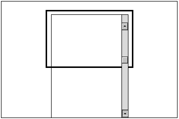
So the reason why web-sites work well in spite of a large number of strange ergonomic matters, (such as long response times and clumsy scrollbars) is virtual parallelism. The level of acceptance of this strangely designed browser and browser technology is actually quite high. This goes to prove, indirectly, that the user's need for parallelism should be considered if you want to design a successful application.
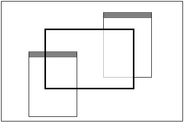
In other words, a web-page is apparently - without designers realizing it- a special form of parallelism which we nearly lost sight of. It explains with Min's PI-theory the fast increase in web-based software in spite of other predicted shortcomings of hypermedia in general and cd-i or old cd-roms in particular [1]. With the disappearance of cd-i's, cd-rom's and ms-dos, proof has been given that users like to have everything parallel in sight, in spite of designers saying the opposite. I am convinced that the success of the now familiar SUN-workstations, with large screens and many open windows, is based on it. Figure 3 shows in a scheme this type of design of various information elements on a screen that belong together.
The question is: How to solve the need of humans to be able to see things all at the same time? There is a simple and a difficult answer. Firstly: designers should be aware of this type of memory problem among users. The next step could be: take a larger monitor or a screen with a higher resolution. Then you can put more information on a screen. Or you can use paper instruction materials, this would diminish the lack of space on your screen. Paper (or a print of what you've downloaded) is often cheaper and certainly ergonomic in many cases - due to the Parallel Instruction theory - and more practical.
Parallelism as concept
The question in 'split attention' situations as described here is: what and how much instruction do I need minimally -in respect of space- in order to solve a problem interactively? See figure 4. Define the problem as A and instruction as B. So instruction is more or less parallel to the problem [1] [6].
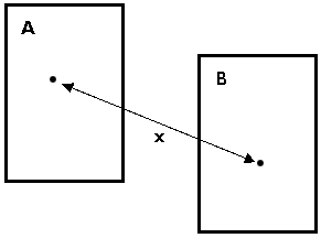
The question will then be: Which distance x should a designer at least keep between those two aspects A and B? The question is connected with how much information should minimally be side by side on the screen (in square cm) (and remain side by side) when other information is put on top of it by the application? It is not desirable to have a screen full of all kinds of 'useful' information. Then the user will not be able to see the wood for the trees. What is the optimum? Can an optimum be achieved, for instance in density of information or distance between parts of information. Is there an absolute optimum in a work or learning environment or are there (user-related) conditions? Which are those conditions? Etc.
The point is: what and how much information or instruction do I need when working on a computer in view, flat, simultaneously, in order to work well or do a task or learn something in an interactive, dynamic learning environment?
Every software designer feels instinctively how he should solve the above problems. But because of the instinctive aversion to seek solutions in combination with paper or books parallel to the screen, some designers sin from time to time by wanting too much in an application for a wider audience. They lean too much on the memory of this audience. The information is there, but it does not come out parallel. That can be an error. The PI-theory explains this with the help of cognitive psychology: some users have an irritatingly brief short term memory. Therefore our advice is to stimulate the (natural) need of a software user to want to have all kinds of information side by side and together. Our concept in respect of parallelism should be better applied in applications.
[2]. Information on the 'split-attention theory' can be found in Chandler &
Sweller, 1991. See also 8.
[3]. Information on the 'cognitive load theory' can be found in Sweller, 1990
- 1994. See also 8.
[4]. Information on the multimedia learning theory can be found in Mayer,
1995. See also 8.
[5]. Information on the dual code theory can be found in Paivio, 1990. See also 8.
[6]. The parallel instruction theory is actually more than just for
instruction. This theory comes out even better if the term 'instruction' is
generalised and replaced with 'information'. It might be better to speak of
the 'parallel information theory' in future rather than 'parallel
instruction' theory.
[7]. In the term 'virtual parallelism' virtual does not mean something digital
or a web-asite, but that information is easy to handle, to find, and stays
side by side. See also 8 and 9.
[8]. Cognitive Load Theory; Split Attention theorie; Dual Code theory; e.d. [online] available on: http://projects.edte.utwente.nl/pi/teksten/parallellismeRef.html
[9]. Parallelism; Parallel instruction; Parallel information; PI theory; e.d. [online] available on:
The first concept of this article was published in Dutch in 'Informatie', a NGI journal,
the journal of the 'Nederlandse Genootschap voor Informatica'.
Enschede, may, 31, 2002; updated aug. 1, 2002