e-Learning Environments on the world wide web, based on the Concept of Parallelism
empirical study with abstract and concrete tasks
(based on simulation experiences)
by Rik Min (1), Tao Yu (2) and Gerd Spenkelink (1);
University of Twente (UT); PO Box 217; 7500 AE Enschede; the Netherlands.
eMail: min@edte.utwente.nl;
www: http://users.edte.utwente.nl/min
(1) Researcher, Centre for Telematics and Information Technology (CTIT)
(2) Master student, Faculty of Educational Science and Technology (EDTE)
Abstract
Students today no longer work in lonely attic rooms or spend their time in noisy lecture rooms or the deadly silence in huge reading rooms of an university library. These components of his working-, doing-, or learning environment still exist, but the functionality has changed. Most of the students in the Netherlands and at our university, the University of Twente (UT), have an excellent connection with the electronic highway on the campus or at home. The world wide web is extremely popular, both among professors and students.
At our university we do a lot of research on the design of higher order e-learning environments with problem solving skills and modern multimedia coaching techniques. Mostly we combine this research with our own courses and our students in courses about courseware engineering. The type of courseware we study is 'higher order' courseware in open and distance learning environments (ODL) Our colleagues and our (master) students do research into modern, multimedia learning environments based on environments designed specifically for simulation and the 'Parallel Instruction' theory (PI), a design theory for web-based simulations and PC based problem solving.
One of our recent projects is now part of the Minerva-project of the EU: the open and distance learning environment-project and ICT, the ODL/ICT-project, in combination with partners from Eindhoven, the Netherlands, and partners from the UK and Italy.
In this paper we discuss an experiment that was run with a prototype, designed in conformity with the PI theory. We designed a web-site with five different e-learning conditions, and ran an empirical study in which 20 students (as users) worked through an abstract task.
The five basic designs were based on the hypotheses of the PI theory that for solving tasks on screens all task relevant information must be in view; as good as possible. The condition with two parallel viewports ('frames') appeared to be the best design for this type of task, better than the window versions we normally used for our computer simulations on the web.
We not only describe the results of the abstract task in the five conditions, but we also discuss the results from the perspective of concrete, realistic tasks in computer simulations. We expect that a design with virtual parallelism, will produce the best performance with realistic concrete tasks.
Key-words: e-learning, hypermedia, multimedia, world wide web, web-technology, problem solving, task-oriented, instruction, instruction theory, designing, design theory, screen design, parallelism, parallel instruction, splitt attention, dual code and cognitive load.
Introduction
Less than ten years since its release, the world wide web has become a prominent new place for people where they can communicate, work, trade or spend leisure time. And increasingly, too, a place to learn; also with interactive skills. Its growth-rate is impressive: from a few dozens of servers and sites in the beginning of the 1990's to more than ten million servers today. From a predominantly text-based environment to a sophisticated multimedia delivery tool. From a limited and clearly defined population of users (mostly dealing with academic, research, or institutional tasks) to a large and varied world community of users (an estimate of about hundreds of millions) across diverse countries, age-levels, occupations, interests, and purposes.
Problem description
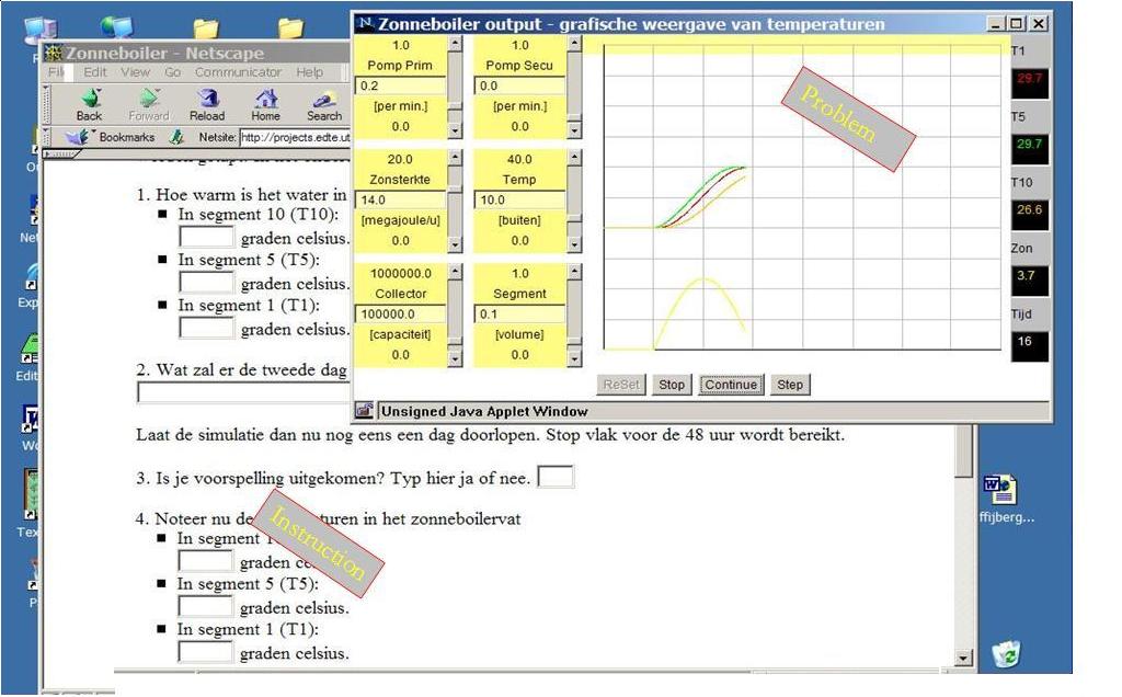
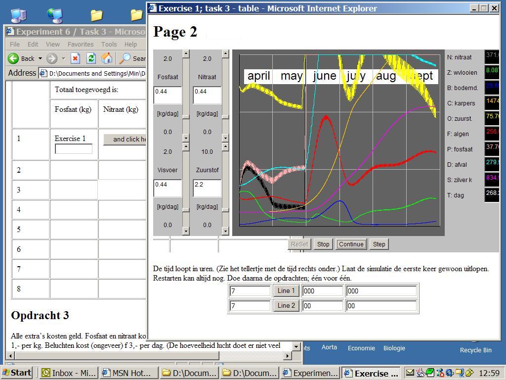
When learners face an e-learning environment, some problems can not be avoided, for instance, the problem of cognitive overload and linear output of most information. They suddenly realize that the information is not too less for them, but that it is too much. They risk cognitive overload. Another problem is that learners often feel that monitors are too small for them when they need more information simultaneously. See figure 1, 7 and 8 for the concrete task and figures 4, 5 and 6 for the abstract tasks. Actually, they are facing a problem of information arrangement, organization and management online. Most windowing systems follow the independent overlapping windows approach, which emerged as an answer to the needs of the applications and technology in the 1980s'. Advances in computers, display technology, and the applications demand more functionality from window management systems. Educational researchers, instructors and curricular designers also need to take it into consideration if they want to create a high quality learning environment. Among different solutions, the parallel instruction theory, the PI theory, and the concept of parallelism provide a constructive opinion from its unique perspective.

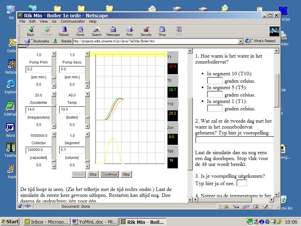
Figure 1. Daily live in schools on the web: a simulation and an instruction on one, small PC screen with two (parallel) windows. The screendump shows a simulated model-driven sun heater and boiler tank in an extra window near the regular web-page with the instruction and a form. The task, here, is to observe the graphical and numerical data in relation to an intervention, and write the results in the form.
Before the advent of the computer, monitors were used to transfer information or to instruct the viewer. With the arrival of the personal computer, the monitors of television were assigned new and other roles. Nowadays information is no longer about passive information that can't be influenced, but information you can do something or work with. According to us, the monitor is not up to this new task.
A monitor is a bottleneck in many interactive doing-, working- and learning environments.
Learning from practice
Our university has a long tradition in computer simulation research in combination to e-learning (van Schaick Zillesen, 1990; Min, 1992 and 1994; van Joolingen & de Jong, 1996). All our groups do research until now, to problem solving in complex simulation environments. Our group has found that problem solving is difficult if the software isn't well designed; especially in complex e-learning environments if there isn't good (parallel) instruction and/or if there isn't a good overall design (Claessens, Min & Moonen, 1999). Software doesn't work if a user has to solve something on the screen and he needs additional information which is not yet present. That is a real problem in hypermedia. A user has to search some thing and the problem literally disappears out of sight. Much courseware for e-learning, like hypermedia, has a too much screen-by-screen nature. That type of courseware is too linear. Web-media have one advantage: the pages are longer than the screen. That gives according to our group posibbilities for 'virtual parallelism' and page-by-page-media. Both kinds of design are better for solving problem on monitors, than screen-by-screen-media on old educational cd-rom's or cd-i's (Min, 1996). One screen on a monitor, including the content, the information, disappears when the next screen with contents appears. Many users find this unpleasant, consciously or unconsciously. They can't handle it, cognitively speaking. A text or image is often hard to back track. In the past a lot of educational software with a screen-by-screen nature was designed without thinking about the maximum cognitive load of most of the users. These theoretical insights from cognitive psychology and recent designing theories provide us with explanations why certain educative projects failed.
User interface
In a web-based environment, the format and form of the output information play very important roles for effective learning. This concerns two critical aspects of all instructional applications on interactivity and interface, including screen design. "Interactivity, or instructional features that promote active learning, provide critical support to increase in learning and retention in all education activities" (Fenrich, 1997). Interface is an integral part of the functions of all instructional web-page applications. The amount of attention paid to the elements on the screen can often determine the success or failure of the web-based instruction.
At present, the interface of a computer provides information mostly in a linear way, just like on television. A large number of learners and users prefer that everything in a learning environment should be within reach, easy and clear. This was already well known for simulations, but technically hard to realize for courseware writers or most of the educational software houses (Van Schaick Zillesen, 1990). The same applies to web-based learning, doing and working environments. Good interactive learning environments for problem solving require parallel instruction, parallel coaching of one kind of parallel information blocks. We see a lot of parallel instruction situations all round us in everyday life; also in education and schools in real simulation environments as shown in figure 1, 7 and 8. Although we are not aware of it, parallelism is a frequently occurring phenomenon in class and also in ordinary life, in museums or on television where one is flooded with textual, visual and audio information; all together through ears and eyes: parallel (Min, 1994). The multimedia designers should predict the cognitive load for the user, in relation to the task and the effectiveness of the working or learning environment.
The concept of parallelism
According to our earlier research with educational software engineerings projects, information for instructing and learning purposes should be presented in a parallel setting instead of a non-parallel setting. So what is parallelism? Simply speaking, we call multimedia processing information, together with other information in all modalities via a device or screen, nessessary for executing a task, parallelism. Here we adopt the definition given by Min (1994), the inventor of the concept of parallelism:
Parallelism is a concept, that is applied by designers of doing-, working- and learning environments, to present as much relevant information as possible (and desirable) on as large a scale as possible; especially in task-oriented environments as instruction or information is needed for solving case-oriented problems.
Screens or interfaces, designed conform the ideas of parallelism, give the user the possibilities to compare everything to everything else, whereas the (short-term) memory of the user or his capacity for retention does not need to be consulted. The regular large screens of SUN computers and control rooms of operators illustrate this need of users to execute a task in a working environment. Thus, in web-based or computer-based learning environments, parallelism can be taken as the way designers and users organize the learning environment on the computer screen as well as in area around the monitor: the papers. In that situation, people could be best motivated to receive instruction because they can decide by themselves what, when and how much they need. With linear instruction, the instruction as a one-way method of information output, always seems to arrive at the wrong time and will result in low quantity and the information needed by the learners always seems to disappear by the time it is needed. Therefore parallelism could be a good solution for instruction and instrument design.
In fact, parallelism, as a common phenomenon, occurs almost everywhere in our daily lives. In this era of information explosion, information always reaches us by different channels, frequently it appears in a parallel way. See also the parallels with the dual code theory (Mayer and Anderson, 1991). Most of the examples of parallelism are first order parallelism: everything is in view. For instance, the information printed on a newspaper can be seen as 'first order parallelism', the products exhibited in supermarkets are a kind of parallelism, and a manual together with computer teaching also is parallelism. Parallelism in overlapping windows is called as 'second order parallelism' by us (Min, 1994). All these examples illustrate that parallelism means that information is arranged side by side, simultaneously or immediately showable as done in desk-top publishing situations with overlapping windows or in web-browsers with large web-pages. That last type of non-first order parallelism is called 'virtual parallelism' (Min, 2001).
The theory of Parallel Instruction
In general, the Parallel Instruction theory, as a design theory, can be understood as follows: when someone has to implement an instruction design or build an open learning- or working-environment, you should do everything within your power to have all loose components with in easy reach and ready for use. You should remain in the position (or state) which you have (or had) at the time. In particular the instruction, feedback, tasks, the solution room, scrapbook etc. should be parallel to the open learning environment of the (bare) simulator (with the key to the problem) (Min, 1992 & 1994). The PI theory has to overlap the cognitive load theory of Sweller, the split attention effect and the dual code theory of Mayer (Chandler & Sweller, 1991; Mayer & Anderson, 1991; Mayer & Moreno, 2000).
In the earlier period, the PI theory was described as a set of hypothis (rules) and formulated in the way of: if A and B is true, under condition (or rule) C, than situation D is predictable. A second condition is that the theory is partly proved in empirical studies with a statistic outcome with a high probability. More concrete:
If
- (rule 1:) the user can not compare two or more things on his screen, in his view, things as texts, the problem or more information or more instruction, or all togeter, from the past to things like these of the present (the 'just in time' and 'just on place' aspect),
- and/or (rule 2:) the user has a limited working memory and a limited capacity for retention as regards details or loose components or the user has no time to use it or is too lazy for full attention to the problem or the - overall - cognitive load for technical details is too high; because the monitor and the content on hyperpages always disappears out of view (the 'cognitive overload' aspect),
- and/or (rule 3:) the user wants to gain insight into cause-effect relations, through repeated verification and/or comparing things (with other things), and it is not possible on the screen or in something else (perhaps a parallel situated book or a sheet of paper) (the 'cause-effect relation' aspect),
- and/or (rule 4:) the user wants to create his own frame of reference and should not be able to do so; by putting things that pass by on the screen, side by side (by means of windows) and comparing them (the 'building a correct cognitive map' aspect),
then it is supposed that the user can't work very well in such environment and your application will fail (because your application is not well designed or is to linear or there is to less parallelism and so on) and so it will not used by users, problem solvers, schools, distance learners or training centers.
Summerized on a other way: the PI theory assumes that a user in an open learning environment only can work and learn effectively, if the environment has been designed in such a way that all relevant information for decision taking is visible (or immediately retrievable), because otherwise problems with working memory will hamper problem solving.
People don't like working environments in which an important number of information objects or objects for comparising, are not parallel (in view). Nor do users like situations when there is no parallel instruction when he need it, to solve a problem or if it costs him too much cognitive load. Also if his brains do not work 100% or his eyes instinctively don't accept that there is too much distance between the 'problem' and the 'instruction' your software is sub-optimal.

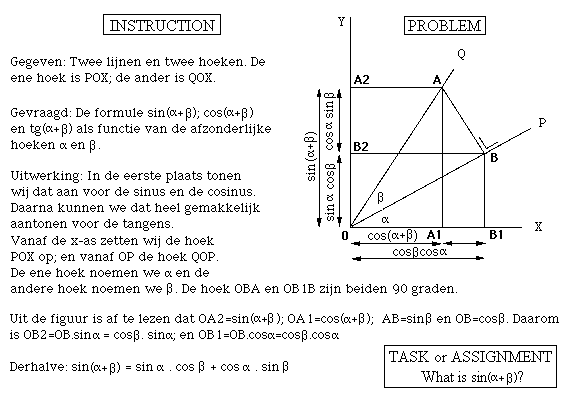
Figure 2. A split attention situation in school books in maths-lessons: on the left the description of the problem (the 'instruction') and on the right the visualised problem (typical 'first order parallellism').
Further research will have to reveal which psychological variables and design variables play a part for the user and in the software. Also why and under which conditions the user will best develop in such an e-learning environment. The problem of proper parallel simulations or microworld with problem-oriented tasks is the implementation of all of the needed viewports or windows in parallel. In most systems this results in non parallel instructions.
METHOD
Here the experiment is described. The overall design is the planning of the different conditions an the sequences of the experiments in relation to the different designs. All tasks in this experiment are abstract and theoretical tasks, based on our earlier experiences in the Centre of Telematics and Information Technology (CTIT) and Faculty of Educational Science and Technology (EDTE), with courses about multimedia and simulation and a lot experimental demonstration programs on simulations in e-Learning situations (Min, 2001).
Table 1 and figure 3 (a to e) give information for the general design of the experiment and what kinds of decisions and preparation have been made. Three methods were used to collect data: observation and recording, interviews and data collecting through automatic logging system. All these make the validity and credit of the experiment high.
The task
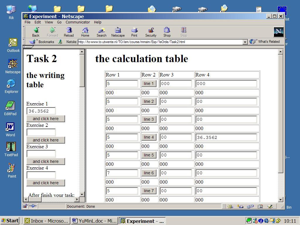
The specific context for the design and redesign the prototypes in the experiment are abstract, theoretical tasks about reading and writing different series of numbers. In all the different designs the same task is used. The task is to copy number strings from 'the problem space' to the form. One task is composed of 4 small exercises. Each exercise is related to one of the 4 respons fields (see the left viewport in figure 4). Each exercise includes one series of values for reading and writing in a form; randomised. There are 4 fields with floating point numbers, varying in length from 4 to 7 digits. Each of the 20 subjects have to complete 5 time the same tasks but with different values in the exercises. Each task has a small difference in the instruction texts accoording to the five different designs.
The designs
We have not described all of the general design and redesign steps in our project. In this paper we only give more information about the five different conditions: the five different designs. We envisioned 5 implementations using the 3 different phenotypes of parallelism: 'first order parallellism' (with two ore more different viewports also named 'frames' in web-technolgy), 'second order parallelism' (with two or more different windows) and 'virtual parallelism' (which is a scroll page which is longer the visible part of the page). For detailed information about these phenotypes see Min (2003). Respectively we chose these five designs for our tasks:
- Design A: experiment with parallel paper instruction and with virtual parallelism (condition A):
- a webpage with the problem and the instruction. See figure 3a;
- the web-page is larger than the 'viewport' of the browser;
- the problem 'lays' outside the monitor or the viewport of the browser (outside the white line);
- the instruction is beside the monitor, on the right, on a piece of paper.
- Design B: experiment with parallel paper instruction with viewports (condition B):
- a webpage with the problem and the instruction. See figure 3b;
- the problem is situated in one of the viewports (frames);
- the instruction is beside the monitor on a piece of paper.
- Design C: experiment with parallel paper instruction with windows (condition C):
- a webpage with the instruction. See figure 3c;
- the problem is in the extra window (at the top) (sometimes partly outside the white line);
- the instruction is beside the monitor on a piece of paper.
With respect to the actual task these 3 designs represent all possible phenotypes. Because the instructions are avialable on paper the repesent an other level of parallelism. This gives us the opportunity to design two more conditions of parallelism:
- Design D: experiment with digital parallel instruction (without paper instruction) (condition D):
- a webpage with the problem and the instruction. See figure 3d;
- the instruction is embedded in the web-page ('virtual parallelism');
- the problem isn't visable on the monitor.
- Design E: experiment with parallel paper instruction from a large distance (2 meters) (condition E):
- a webpage only with a problem. See figure 3e;
- the problem is on the monitor and the sheet with the parallel instruction lies 2 meters away;
- this experiment is used to count the number of walks between the instruction and the problem.
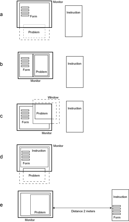
In figure 3a to 3e, you see 'the problem' and 'the instruction' in five web-designs. In each web-design the subjects 'have to solve' the same 'problem' with the same 'instruction'. Only the values for using, remembering and writing (retention) - per exercise - are different (randomised). The last experiment, design E, with a 2 meter's 'walking distance' between the instruction and the problem, is to observe and count the number of walks between 'the instruction' and 'the problem' on the screen. So the researcher doesn't need eyetracking facilities.
Table 1. The designs in the experiment and the types of parallelism.
| |
Design A |
Design B |
Design C |
Design D |
Design E |
| Type: | with large webpage
(virtual parallelism) |
with viewports
(first order parallelism) |
with overlapping windows
(second order parallelism) |
all in one one webpage
(virtual parallelism) |
combination of a task on screen and an instruction on a large distance |
| Design: | See figure 3a |
See figure 3b |
See figure 3c |
See figure 3d |
See figure 3e |
These recordings are an indication of the working memory of the user (Yu, 2002). Behind these designs all ideas of parallelism and the most important aspects behind the PI theory can be found. All types of parallelism are showed clearly. Here information appears on paper or on screen, simultaneously with problems. The subjects are non trained master students (n=20) from the University of Twente (Yu, 2002). In table 1 you see the design of the experiment.

Figure 3. Design situations in the experiment: condition A until E. You see the problem and the instruction in our five experimental design situations. In each situation the subjects have to solve the same problem with the same task and instruction text; only the values for using, remembering and writing (retention), are different. The 4 fields in the form to fill in these 4 values, and to send them automatically to our log-system, are drawn in each design.
- a. Design A: a webpage with the problem and the instruction. You see the monitor and the browser. The web-page is larger than the 'viewport' of the browser. The problem 'lays' outside the monitor (or outside of the viewport of the browser). The instruction is beside the monitor, on the right, on a piece of paper.
- b. Design B: a webpage with the problem and the instruction. The problem is situated in one of the viewports (frames). The instruction is beside the monitor on a piece of paper.
- c. Design C: a webpage with the instruction. The problem is in the extra window (at the top) (sometimes partly outside the monitor). The instruction is beside the monitor on a piece of paper.
- d. Design D: a webpage with the problem and the instruction. The instruction is embedded in the web-page ('virtual parallelism'). The problem isn't visable on the monitor.
- e. Design E: a webpage only with a problem. The problem is on the monitor and the sheet with the parallel instruction lies 2 meters away.

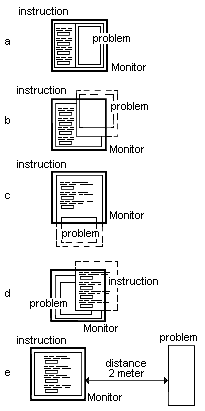
Figure 3x. Announcement; new experiment in progress (Min, 2004) (coming soon).
- a. Design A: a webpage with frames: the problem (at the right) and the instruction (at the left).
- b. Design B: a webpage with windows: the problem and the instruction.
- c. Design C: a long webpage with the problem and the instruction.
- d. Design D: a webpage with windows: the problem and the instruction.
- e. Design E: a webpage only with a form and an instruction. The problem is on the sheet on 2 meters distance.
Each of the 20 subjects has to complete 5 tasks. Each task has the same instruction text but different generated values. Only the showed values in the tasks, in the exercises, are random selected by the designers. This design of the tasks gives us the best indication for splitt attention effect, retention, cognitive load and the users working memory.
The subjects get the printed instruction on a sheet from the coach. If you follow the instructions on the sheet, they can do the exercises to finish the task. Every task has four exercises. An exercise is reading values and writing numberstrings in fields of a form. After finishing the four exercises of each task, the subjects need to type their names, then the defaulted automatic feedback system will record all the important times, per exercise, used by the subject, and send an e-mail to the research-group. This mail contains the main logging data and information needed.

Figure 4. A screendump of design B. See the two viewports and the (two) scrollbars.
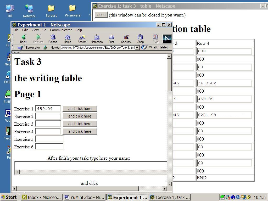
Among these tasks: all the texts of the tasks are similar. The only difference between them is that the instruction of most of the tasks is given on paper while the instruction in design E is given on the screen of the computer. In figure 3E the schematic design is shown. The theory behind task 5 (Design E) is similar to the other tasks in the other designs.

Figure 5. A screendump of design C. See the two overlapping windows.
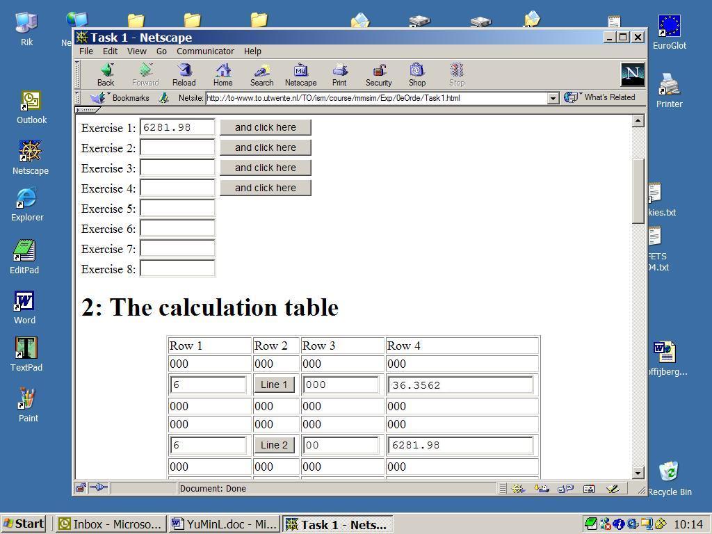
Design B and design C, among all the tasks designed and redesigned, could be taken as the patterns of the application of the parallelism concept and the results depend on the theses of the PI theory. They are also the popular styles of the output formats of information on the web-sites, which can be regarded as the significant influence of parallelism and the PI theory for the web-based environment. Design D and design A with the long web-pages, could be seen as new ideas xxx.

Figure 6. A screendump of design A. Remark the long designed web-page with the scrollbar. The user can't see the whole 'problem' and other things in the web-page at once; that is what we called virtual parallelism.
RESULTS
After experiencing the experiment conducted in our research about parallelism and the PI theory, the research results are highly consistent with the basic tendency of the PI theory and our assumption that the PI theory does work as a design theory in web-based learning environments. The evaluation of the collected data also shows the same results.
Table 2: Data Analysis (n=20)
| |
Exercise One |
Exercise Two |
Exercise Three |
Exercise Four |
Total |
| Design |
Time used |
Time used |
Time used |
Time used |
Time used |
| A |
| Mean: 25.46 sec |
| Mean: 13.76 sec |
| Mean: 11.20 sec |
| Mean: 9.3 sec |
| Mean: 59.73 sec/subject |
| B |
| Mean: 14.98 sec |
| Mean: 11.87 sec |
| Mean: 7.94 sec |
| Mean: 8.70 sec |
| Mean: 43.49 sec/subject |
| C |
| Mean: 21.23 sec |
| Mean: 10.63 sec |
| Mean: 7.49 sec |
| Mean: 8.63 sec |
| Mean: 47.99 sec/subject |
| D |
| Mean: 17.08 sec |
| Mean: 9.64 sec |
| Mean: 8.17 sec |
| Mean: 9.00 sec |
| Mean: 43.92 sec/subject |
| E |
no data |
Through the overview and analysis of the process of the experiences and the summerized results as mentioned in tables 2 and 3, conclusions can be got as follows:
- Parallelism and the PI theory also work well in web-based learning environments. The result shows that 100% subjects prefer design B (the parallel exercise) as their open learning, working, and doing environment.
- Distance does influence the effectiveness and the efficiency of learning and influences the motivation of learners. 95% (19 subjects) chose the extra task (Design E) as their learning environment neither on the web-based, computer-based nor other learning environment even the physical distance is not so far away, say two meters. One exception is that one of the subjects (5%) likes the design of task five because she thought it was a good idea to motivate and practise one's memory. That is no paradox to Parallelism and the PI theory, in contrary, it proves that parallelism can reduce the cognition load during learning and working.
- Among the first four regulative tasks, the choices of the subjects show a different individual favour. 50% (10 subjects) said design C (the task with a top window) was the last choice for them while 45% chose design D, which has a long window on the screen and the instruction is digital. The problem for design C is that when it is closed, the top window will hide so the user will need a lot of time to find it back and click on it. It shows clearly that users do not like any work which is at risk to increase extraneous cognitive load. While the problem for design D is that the users also spend extra energy in such long pages to find necessary information. An interesting phenomenon is if the roller in the mouse of the computer works well, more users will prefer design D because the easy use of the roller will save time.
- Only 5% (one subject) thought design A was the worst learning environment for them. Actually the biggest difference between design A and design D is that the instruction materials are on paper instead of on the computer in design A, while the length of the window is a problem in design D. This result seems to prove that users and learners still like to use paper materials, manuals and instruction sheets as parallel instruction materials.
- Coaching is still necessary even if offering literature instruction. Part of the subjects can not understand the terminology and special nouns when they face a new learning environment or strange instruction. It will take a long time and much effort to get an complete comprehension. Taking this experiment as an example, 60% of the subjects (12 out of 20 subjects) asked us to explain what the 'last value' was or the 'frame' and 'field' and so on.
- Distance really causes problems for people with a poor working- or short-term memory. According to the observation and records, there were four subjects (25%) who had to check the instruction and the exercise twice during design E, in which there is a distance of two meters default. Apart from this one subject (5%) had to check three times because he is older than the others. So a hypothesis arises here that parallelism in software products may work well for some people who are lazy or not motivated sufficiently or have a poor working-memory or perhaps elderly people. Table 2 lists the outcome of the observation (Yu, 2002).
Table 3: Results of the experiment (n=20)
| | Design A | Design B | Design C | Design D | Design E |
| Number of errors: | 5 errors | 1 error | 3 errors | 7 errors | no data |
| (in procents) | 6.25 % | 1.25 % | 3.75 % | 8.75 % | no data |
| Respons times: | Mean: 59.73 sec | Mean: 43.49 sec | Mean: 47.99 sec | Mean: 43.93 sec | no data |
100% of subjects prefer the real parallel design B more than the other designs. 95% of subjects dislike design E, but that design was not designed to be user-friendly but only for observation purposes. Our observations in design E tell us that 20% of the subjects have to check each exercise twice; 5% checked them three times. That is an indication of too much cognitive overload and/or a bad short time memory. So design E is a control design to check user characteristics.
CONCLUSION
Our method to collect data - through automatic logging system - gives a lot of good data (times). Also the results to calculate means and totals, were good enough for conclusions.
The experiment shows that design B, with the two viewports is the best. The relations between what we have discussed about the orderly splitt attention situation we found very interesting. The relation between design B and the situation of 'the problem' (the mathematical figure) and 'the instruction' (the text) in figure 2, is based on real parallellism ('first order parallelism').
Parallelism and the PI theory, as an useful design theory, proved to be welcome among the users. Parallelism and the cognitive aspects of the PI theory can be good solutions to problems such as small screens, cognitive overload of information, linear output of the information and so forth. In fact, parallelism does not mean the more information the better, but it means that necessary and reliable information is never too much; maybe the name 'Parallel Information theory' is more suitable. More and more cases show that the PI theory can be applied to many domains, including in commercial, industrial and military applications as the experiments of Cleassens shows (Claessens, 1999).
A logical continuation of the present experiment is the implementation of a concrete task in stead of the present abstract task.
That next experiment will be focused on a real simulation task. We have two candidates: our sunboiler contol task, as shows in figure 7, and our fish pond contol task as shown in figure 8.

Figure 7. The sunboiler contol task. This screendump showing the screen design and the more concrete task for our next experiments.

Figure 8. The fish pond contol task for breeding carps and silvercarps in relation to oxygen, phosphate, sunlight and so on. The screendump shows a situation with parallel instruction in the left-bottom window related to the problem (to solve) in the right-upper window for our next experiment.
The difference in the two concrete task is the data that the subjects have to manipulated are meaningfull data whitin the contect of the subjects mental model of the sunboiler or fishing pond, in stead of meaningless numbers as was the case in our experiment. The second relevant difference is that the (parallel) instructions are no longer provided on paper but are integrated on the screen in windows or viewports. The integration of the instructions is expected to highlight the mean problem: the lack of space on regular screensizes that is associate with the type of linearity by current hypermedia. We think that just in place information is more profitable to the user in task oriented e-learning environments then only just in time information as some authors claim.
Figure 2 illustrates that problem solving in a book works very satisfactory. Unfortunity eduactional software designers often do not recognize the importants of parallelism in old fashioned paper instructional material.
For long period we thought that a design with two windows, one for the simulator and one with the instruction and other texts, is the best design for very realistic and complex simulations (Min, 2001). Our problem with our new experimental results and design B (condition B), is that we think we find in our next experiments that design D (condition D), which the long webpage ('virtual parallelism'), gives - in a lot of cases - the best result.
The mean problem in abstact task that alienation of the task from the context. The cognitive load in concrete task is often much higher because of the contextual information that has to bee processed.

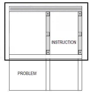
Figure 9. The best design for learning-, working- and doing enviroments, if there is a concrete task and a lot of information is required, is two viewports, mostly with two scrollbars.
About the scrollbar interface of browsers we know that before the internet become very popular scrolling was not done in multimedia applications. But we know now a days an application with scollbars is not a problem for users; especially not for children.
We think that solutions with parallel viewports with one or two scrollbars is the best. (See figure 9 for the basic concept of that design.) But also - if you use scrollbars on a correct way - long web-pages with vertical scrollbars, may be the second best design for task-driven environments on PC screens.
References
Claessens, M. (1999). The effect of different ICT-designs on learning specific tasks; First year report of PhD Study. University of Twente. Projectleader R. Min; supervisor J. Moonen. [Online] Available on internet:
http://projects.edte.utwente.nl/pi/Papers/indexClaessens.htm.
Fenrich, P. (1997). Practical guidelines for creating instructional multimedia applications. Orlando: The Dryden Press.
Joolingen, W.R. van, & de Jong, T. (1996). Design and implementation of simulation-based discovery environments: the SMISLE solution. Journal of Artificial Intelligence and Education, 7, 253-277.
Mayer, R. E., & R.B. Anderson (1991). Animations Need Narrations: An Experimental Test of a Dual-coding Hypothesis. J. of Educ. Psych. Vol. 83, No. 4, 484-490.
Mayer, R. E. & R. Moreno (2000). A Split Attention Effect in Multimedia Learning: Evidence for Dual Processing Systems in Working Memory. J. of Educ. Psych., Vol. 90, No. 2, 312-320.
Miller, G.A. (1956). The magical number seven, plus or minus two: Some limits on our capacity for processing information. Psychological Review, 63, 81-97.
Min, R., (1992) Parallel Instruction, a theory for Educational Computer Simulation.
Interactive Learning International, Vol. 8, No. 3, 177-183.
Min, R. (1994). Parallelism in open learning and working environments. Britsh Journal of Educational Technology, Vol. 25, No. 2, 108-112. ISSN 0007-1013.
Min, R. (1996). Parallelism and the Parallel Instruction Theory. [Online] Available via the World Wide Web at
http://users.edte.utwente.nl/min/home/Theory2.htm.
Min, R. (2001). Simulation and discovery learning in an age of zapping and searching; a treatise about the educational strength and availability of digital learning tools and simulation on the World Wide Web. [Online] Available on the World Wide Web at
http://projects.edte.utwente.nl/pi/Papers/DiscLearning.html.
Moreno, R., & R.E. Mayer (2000). A coherence Effect in multimedia learning: the case for minimizing irrelevant sounds in the design of multimedia instructional messages. J. of Educ. Psychology, Vol. 92, No. 1, 117-125.
Mousavi, S. Y., Low, R., & Sweller, J. (1995). Reducing cognitive load by mixing auditory and visual presentation modes. Journal of Educational Psychology, Vol. 87, No. 2, 319-334
Sweller, J. (1988). Cognitive load during problem solving: Effects on learning. Cognitive
Science, Vol. 12, 257-285.
Sweller, J., van Merrienboer, J. J. G., & Paas, F. G. W. C. (1998). Cognitive Architecture and Instructional Design. Educational Psychological Review, Vol. 10, No. 3, 251-296.
Schaick Zillesen, P.G. van (1990) Methods and techniques for the design of educational computer simulation programs and their validation by means of empirical research. PhD. thesis, University of Twente, Enschede, Holland (promotors: E. Warries and R. Min).
Yu, T. (2002). Empirical study to Cognitive Load and the PI theory with well-designed products for procedure skills and parallel instructions. Master Thesis, University of Twente. Enschede. R. Min: projectleader and designer; J. Moonen: supervisor. Online available on internet:
http://projects.edte.utwente.nl/pi/Papers/indexYu.html.
Literature
Baddeley, A. D. (1986). Working memory. Oxford: Clarendon Press
Baddeley, A. D. (1992). Working Memory. Science, 225, 556-559.
Benshoof, L.A., & S. Hooper (1993). The Effectes of Single- and Multiple-Window Presentation on Archievements During Computer-Based Instruction. J. of Comp. Based Inst., Vol. 20, No. 4, 113-117.
Berenfeld, B. (1996). Linking students to the infosphere. T.H.E. Journal, 4(96), 76-83.
Berge, Z. L. (1999). Conceptual Frameworks in Distance Training and Education. In D.A. Schreiber & Z.L. Berge, (Eds). Distance Training: How innovative organizations are using technology to maximize learning and meet business objectives. San Francisco: Jossey-Bass, 19-36.
Bower, G.H. (1975). Cognitive psychology: an introduction. In W. K. Estes (Ed.), Handbook of learning and cognitive processes (Vol. 1) Introduction to concepts and issues, Hillsdale, NJ: Erlbaum, 25-80.
Chandler, P., & Sweller, J. (1991). Cognitive Load theory and the format of instruction. Cognition and Instruction, Vol. 8, 293-332
Chi, M., Claser, R., & Rees, E. (1982). Expertise in problem solving. In Advances in the psychology of human intelligence, Hillsdale, NJ Erlbaum, R. Sternberg (Ed.), 7-75.
Clark, J. M. & Paivio, A. (1991). Dual coding theory and education. Educational Psychology Review, Vol. 3, No. 3, 149-170.
Cobb, P. (1996) Constructivism and learning. In International encyclopedia of educational technology. T. Plomp and D.P. Ely (eds.), 2nd ed.. Tarrytown, NY, Elsevier Science, 56-59.
Collis, B., & Moonen, J. (2001). Flexible learning in a digital world: Experiences and expectations. London: Kogan Page.
Driscoll, M. P. (1994). Psychology of learning for instruction, Boston: Allyn and Bacon.
Miller, G.A., Galanter, E., & Pribram, K.H. (1960). Plans and the Structure of Behavior. New York: Holt, Rinehart & Winston.
Nasseh, B. (1998). Training and Support programs, and Faculty; New Roles In Computer-Based Distance Education in Higer Education Institutions [Online] Available on the World Wide World at
www.bsu.edu/classes/nasseh/study/res98.html. Date accessed June 29, 2002.
Kandogan. E, & Shneiderman. B (1996). Elastic Windows: Improved Spatial Layout and Rapid Multiple Window Operations, In: ACM AVI'96, Symposium on Advanced Visual Interfaces, Gubbio, Italy, 29-38.
Kandogan. E & Shneiderman. B (1997). Elastic Windows: A Hierarchical Multi-Window World Wide Web Browser. In: ACM UIST'97, Symposium on User Interface Software and Technology.
Kirschner, Paul A. (2002). Cognitive load theory: implications of cognitive load theory on the design of learning. In Learning and Instruction: the Journal of the European Association for Research, Vol. 38, No. 1, 1-10.
Paivio, A. (1986). Mental representation: A dual coding approach. Oxford England. Oxford University Press.
Sherry, L. (2000). The nature and purpose of online discourse: A brief synthesis of current research related to the Web Project. International Journal of Educational Telecommunications, Vol. 6, No. 1, 19-52.
Schlager M., Fusco J, & Schank P. (1998). Cornerstones for an On-line Community of Educational Professionals. IEEE Technology and Society, Vol. 17, No. 4, 15-21.
Schneider, W., & Shiffrin, R.M. (1977). Controlled and automatic human information processing: I. Detection, search, and attention. Psychological Review, Vol. 84, No. xx, 1-66.
Shiffrin, R. M. & Schneider, W. (1977). Controlled and automatic human information processing: II. Perceptual Learning, automatic attending, and a general theory. Psychological Review, Vol. 84, 127-190.
Smith, P. L. & Ragan, T.J. (1999). Instructional Design the second edition. John Wiley & Sons, Inc.
Enschede, nov., 5, 2003

Home pagina e-books Rik Min
