A comparison of parallelism in interface designs for computer-based learning environments
by Rik Min (1), Tao Yu (2), Gerd Spenkelink (3) and Hans Vos (3)
University of Twente; PO Box 217; 7500 AE Enschede; the Netherlands.
min@edte.utwente.nl
http://users.edte.utwente.nl/min
(1)
Researcher: Centre for Telematics and Information Technology (CTIT)
(2) Master student: Faculty of Educational Science and Technology (EDTE)
(3) Researcher: Institute for Behavioral Research (IBR)
Is published in: Journal of Computer Assised Learning, JCAL, vol. 20, no. 5, oct. 2004 (Eds. C. Crook, R. Joiner and B. Lewis) ISSN 0266-4909.
Abstract
In this paper we discuss an experiment that was carried out with a prototype, designed in conformity with the concept of parallelism and the Parallel Instruction theory (the PI theory). We designed this prototype with 5 different interfaces, and ran an empirical study in which 18 participants completed an abstract task. The 5 basic designs were based on hypotheses of the PI theory that for solving tasks on screens all task relevant information must be in view on a computer monitor, as clearly as possible. The condition with two parallel frames and the condition with one long webpage appeared to be the best design for this type of task, better than window versions which we normally use for our computer simulations on the web.
We do not only describe the results of the abstract task in the five conditions, but we also discuss the results from the perspective of concrete, realistic tasks with computer simulations. The interface with two parallel frames is the best solution here, but also the interface with long web-pages (‘virtual parallelism’) is a great favourite in practice when doing realistic tasks.
Key-words: e-learning, problem solving, task-oriented, higher order e-learning, instruction, instruction theory, design theory, screen design, parallelism, parallel instruction, instruction design, split attention and cognitive load.
Introduction
Less than ten years since its release, the world wide web has become a prominent new place for people where they can communicate, work, trade or spend leisure time. And increasingly, too, a place to learn, also with interactive skills. Its growth-rate is impressive: from a few dozen servers and sites in the beginning of the nineties to more than ten million servers today.
At our university we do a lot of research on the design of ‘higher order’ e-learning environments with problem solving skills and modern multimedia coaching techniques. Mostly we combine this research with our own courses and our students in courses about courseware engineering. The type of products we study are build for 'higher order' e-learning and open and distance learning environments.
Problem description
When learners face an e-learning environment, some problems can not be avoided. The problem of cognitive overload and linear output of most information, for instance. They suddenly realize that the information is not insufficient for them, but that it is too much. Another problem is that learners often feel that monitors are too small for them when they need more information simultaneously. Most windowing systems follow the independent overlapping windows approach, which emerged as an answer to the needs of the applications and technology in the 1980’s. Innovations in computers, display technology, and interactive educational applications demand more functionality from window management systems. Educational researchers, instructors and curricular designers also need to take parallel windows or parallel frames into consideration if they want to create a high quality learning environment for task-oriented problem solving. Among different solutions, the parallel instruction theory, the PI theory, and the concept of parallelism provide a constructive opinion from its unique perspective.

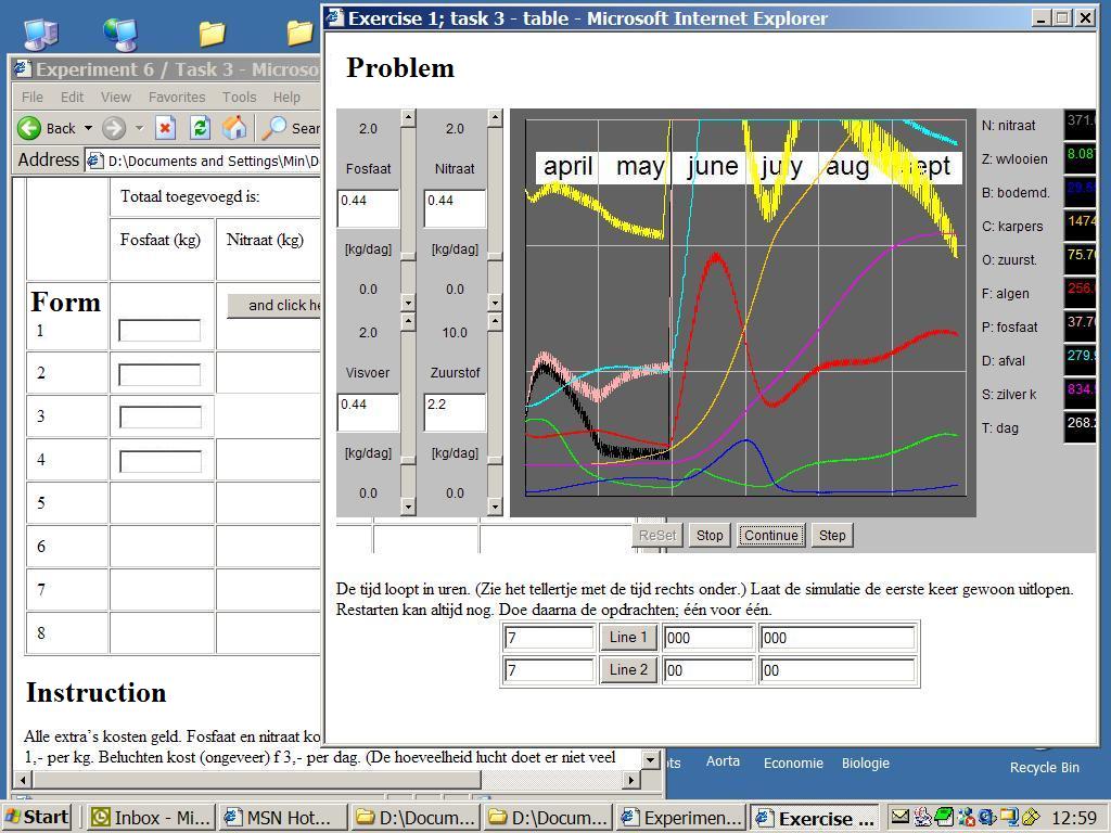
Figure 1. Daily life in schools on the web: a simulation and an instruction on one, small PC monitor with two (parallel) windows. This screendump shows a simulated fish pond for breeding carps and silver carps in relation to oxygen, phosphate, sunlight and so on. It shows a situation with an instruction, in the left-bottom window, related to a problem, in the right-upper window. The task, here, is to observe the graphical and numerical output in relation to the interventions, and write the results in fields of forms.
Before the advent of the computer, monitors were used to transfer information or to instruct the viewer. With the arrival of the personal computer, the monitors of television were assigned new and different roles. Nowadays information is no longer about passive information that can't be influenced, but information you can do something with or work on. According to us, the monitor is not up to this new task. A monitor is a bottleneck in many interactive doing-, working- and learning environments.
Learning from practice
Our university has a long tradition in computer simulation research in combination to e-learning (van Schaick Zillesen, 1990; Min, 1992 and 1994; van Joolingen & de Jong, 1996). Van Schaick Zillesen, Van Joolingen, De Jong and Min, they all did and do problem solving studies with complex model-driven simulation environments at the University of Twente. Van Schaick Zillesen, Claessens and Min have found that problem solving is difficult if the software isn't well designed; especially in complex e-learning environments if there isn't proper (parallel) instruction and/or if there isn't a good overall design (Min, 1994; Claessens, Min & Moonen, 1999). Software doesn't work if a user has to solve something on the screen and he needs additional information which is not yet present. That is a real problem in hypermedia. A user has to search too much in hyperspace to find all the information he needs in order to solve a problem on the screen if information, a task or a problem literally disappears out of sight.
User interface
Much courseware for e-learning, like educational hypermedia has an, as we say, ‘screen-by-screen’ nature. The content of a screen disappears by clicking. That type of courseware is too ‘linear’, which old fashioned ‘screen-by-screen’-media with ‘fixed pages’ are as well. Web-media have one advantage in relation to old hypermedia: the pages are longer than the surface of the screen. This gives beautiful possibilities for 'virtual parallelism' according to our group. That type of courseware is a ‘page-by-page’-medium, with pages longer than the length of a window or the length of the screen. Both kinds of design are better for solving problem on monitors, than screen-by-screen-media on old multimedia on cd-rom's or cd-i's (Min, 1996). One screen on a monitor, including the contents (the information) disappears when the next screen plus contents appears. Many users find this unpleasant, consciously or unconsciously. They can't handle it, cognitively speaking. In the past a lot of educational software with a screen-by-screen nature was designed without thinking about the maximum cognitive load of most users. These theoretical insights from cognitive psychology and recent designing theories provide us with explanations why certain projects failed.
In a web-based environment, the format and form of the output information play very important roles for effective learning. This concerns two critical aspects of all instructional applications on interactivity and interface, including screen design. The interface is an integral part of the functions of all tasks-oriented web applications that combines interactive problems, assignments and instruction. The amount of attention paid to the elements on the screen can often determine the success or failure of your web application.
Cognitive load and split attention
At present, the interface of a computer usually provides information in a linear way, just like on television. A large number of learners and users prefer that everything in a learning environment should be within reach, easy and clear to see. This was already well known for simulations, but technically hard to realize for courseware writers. The same applies to web-based learning, doing and working environments. Good interactive learning environments for problem solving on a screen, require parallel instruction, parallel coaching or one kind of parallel information block. We see a lot of parallel instruction situations all round us in everyday life. Also in education and schools, in real simulation environments, as shown in figure 1. Although we are not aware of it, parallelism is a frequently occurring phenomenon in class and also in ordinary life, in museums or on television where one is flooded with textual, visual and audio information all at the same time. This is in accordance with the PI theory and the split attention theory (Min, 1994; Chandler & Sweller, 1991). Multimedia designers should predict the cognitive load which the user can handle.
The concept of parallelism
According to our earlier research with educational software engineering projects, information for instruction and learning purposes should be presented in a parallel setting instead of a non-parallel setting. So what is parallelism? Parallelism is a concept for designing do-, learn- and working environments.
Definition: The basic concept of parallelism is that all information, necessary for doing a certain task, is presented in view or the user can provide it himself, simply to create an orderly task environment.
In an educational simulation environment for example, this information includes tasks instructions, input fields and output fields. In computer-based environments the size of the computer monitor limits the space that is available for parallel presentation. Interfaces for working- or learning environments, designed according to Min’s ideas about parallelism, give the user the possibility to compare everything. His working memory or his capacity for retention does not come into it. The cognitive load becomes as low as possible. The regular large screens of SUN work-stations, for example, or control rooms for operators, illustrate the users need to execute a task in a working environment. Thus, in a web-based or computer-based learning environment, parallelism can be taken as the way designers and users organize the learning environment on the computer screen as well as in the area around the monitor. In that situation, people will be best motivated to receive instruction because they can decide by themselves what, when and how much they need. Consequently, parallelism could be a good solution for instruction and userinterface design in task-oriented e-learning environments.
In fact, parallelism, as a common phenomenon, occurs almost everywhere in our daily lives. In this era of information explosion, information always reaches us by different channels. See also the parallels with the dual code theory (Mayer and Anderson, 1991). Most of the examples of parallelism are first order parallelism: everything is in view.
The information printed on a newspaper can be seen as 'first order parallelism', the products exhibited in supermarkets are a kind of parallelism. A manual together with computer teaching is also a form of parallelism. The situation of a number of overlapping windows on a screen, as usual in the desk-top philosophy to handle documents, is called 'second order parallelism' by Min (Min, 1994). All these types of parallelism illustrate that parallelism means that information is at hand, arranged side by side and (if necessary) immediately visible. Even long web-pages, both with ‘problems’ and ‘instructions’ combined, are a form of parallelism. We call that kind of parallelism 'virtual parallelism', because the scrollbar interface, nowadays, is very simple to handle for all kinds of users.
The theory of Parallel Instruction
In general, the Parallel Instruction theory, as a design theory, can be understood as follows: when a designer has to implement an instruction or build an open learning- or working-environment, the designer should do everything within his power to have all loose components within easy reach and ready for use. You should remain in the same position (or state). In particular the instruction, feedback, tasks, the solution room, scrapbook etc. should be parallel to the open learning environment of the (bare) simulator (with the key to the problem) (Min, 1992 & 1994). The PI theory has to overlap the cognitive load, split attention, multiple representation and the dual code theories (Chandler & Sweller, 1991; Mayer & Anderson, 1991; Mayer & Moreno, 2000).
Min described in 1992 the PI theory as a set of hypotheses and formulated it like this: if A and B are true, under condition (rule) C or D, than situation E is predictable. There are 4 conditions (rules) in this theory. Schematically:
If
- the user can not compare two or more important things on his screen e.g. the ‘problem’ and the ‘instruction’ (rule 1,: aspect of 'the right place'),
- and
the user has a limited working memory (rule 2, aspect of 'cognitive overload'),
- and/or
the user wants to gain insight into cause-effect relations, through repeated verification (rule 3, aspect of 'cause-effect relation'),
- and/or
the user wants to create his own frame of reference (rule 4, the possibility ‘to build a correct concept map’),
then
it is supposed that the user can not do a monitor-oriented task very well in such an environment; the application is not optimal.
Summarised: the PI theory assumes that a user in an open learning environment can only work and learn effectively, if the environment has been designed in such a way that all relevant information for decision taking is visible (or immediately retrievable). Otherwise problems with working memory and cognitive load will hamper problem solving (Min, 1992, 1994 and 2001, Claessens, 1999, Yu, 2002).
People don't like doing tasks in environments in which an important number of necessary ‘information objects’ are not in view, not parallel. Nor do users like situations when there is no parallel instruction when it is necessary to solve a problem, or when solving problems costs too much cognitive load. Actually, if your working memory or your eyes don't accept that there is a wide physical distance between the problem on the screen and the text of the assignment, then your environment is sub-optimal. The split attention theory and the cognitive load theory also mention these aspects.
Method
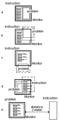
In the present study, five alternative designs implementing different types of parallelism for a computer based task were compared. All tasks in this study are abstract and theoretical, but all the tasks and designs are based on earlier studies with concrete tasks in concrete environments: real existing simulation environments (see in figure 1) (Min, 2001; Yu, 2002). Figure 2 (a, b, c, d and e) gives all the different designs (A, B, C, D and E) applied and shows what kinds of parallelism were used. Three different methods were used to collect data: data collecting through an automatic logging and mailing system, observation, and a short interview afterwards. We asked the participants which interface they preferred and which did they dislike most.
The task
There are four tasks (1, 2, 3 and 4). There is one control task (5). Each task has four assignments. Each assignment has four components: reading the instruction, doing something, reading something (here a number) and typing that number in a computer form. In such a way, split attention problems and cognitive load problems develop. Each task has a different interface (A, B, C and D). Task 5 has design e. In all the different designs we have tried to use the same kind of assignments. Each assignment is related to one of the 4 response fields in the computer form as shown in figure 3. Each task includes one series of values for reading and writing in a form. The numbers are randomized. The 4 fields are like in real learning environments with simulations. Each of the 18 participants has to complete the same tasks in the 5 conditions, but every time with different values.
The designs
We have not described all of the general designing and redesigning steps in our project. This paper gives information about the five different conditions. We envisioned 5 implementations using the 3 different phenotypes of parallelism: 'first order parallelism' (with two ore more different viewports also named 'frames' in web-technology), 'second order parallelism' (with two or more different windows) and 'virtual parallelism' (a page with a scrollbar, longer than visible). For detailed information about these phenotypes see the pilot-experiment of Min and Yu (Yu, 2002; Min & Yu, 2003). For this experiment, we chose the next five designs, respectively:
- Design A: experiment with two viewports:
- the ‘problem’ is situated in a viewport (‘frame’);
- the ‘instruction’ is situated in an other viewport;
- Design B: experiment with two windows:
- the ‘problem’ is in the extra window and sometimes partly outside the user’s view;
- Design C: experiment with a long webpage (‘virtual parallelism’):
- a long webpage with both ‘problem’ and ‘instruction;
- the ‘problem’ or ‘instruction’ is often situated outside the browser’s viewport;
- Design D: experiment with two windows:
- the ‘instruction’ is in the extra window and sometimes partly outside the user’s view;
- Design E (the controll task): experiment with ‘parallel instruction’ at a 2 metre distance:
- the ‘instruction’ is on the monitor and the ‘problem’ is situated 2 meters away;
- this experiment is used to count the number of walks between the two ‘locations’.
In figure 2a to 2e you see the 5 tasks with 'the problem' and 'the instruction' in 5 different web-designs (A, B, C, D and E). In each web-design the subjects have to solve the same problem with the same instruction. Only the values for using, remembering and writing (retention) - per assignment - are different (randomised). Design E, with a 2 meter walking distance between instruction and problem, is to observe and count the number of walks between instruction and problem. These recordings are an indication of the working memory of the user. So the researcher doesn't need eye tracking facilities (Yu, 2002).

Figure 2. The 5 designs in this study. The figure shows the problem and the instruction in 5 experimental situations (design A, B, C, D and E). In each situation the participants have to solve the same problem with the same task and the same instruction text; only the values for reading, remembering and typing are different. The 4 fields in the form to fill in these 4 values and to send them automatically to our log-system are drawn in each picture.
Behind these designs, all ideas on parallelism and the most important aspects behind the PI theory can be found. All types of parallelism are shown clearly. In this experiment, there are 18 participants, all non-trained colleagues from the University of Twente.
The participants get instructions to read a number somewhere in the website. The assignment is to put that value - correctly - in a marked field on a computer form. After reading and writing, response times are registered. When the task is completed, the automatic login system will send the data to the research group by e-mail.

Figure 3. A screendump of design C with two overlapping windows and the abstract read-and-write-task.
Figure 3 shows a screendump of the experimental design B with two parallel windows. Our hypotheses were: design A is the best for doing the task and design B or C are next best.
Results
The evaluation of the collected data shows interesting results. There are no significant differences in average response times as table 1 shows. Mistakes made by participants were few. As results we could not use these data for our statistics. Sometimes a participant forgets parts of the assignment while reading the values of a number. In that case the cognitive load is too much. This occurs mainly in the design B, C and D. Participants will then manipulate the windows or scrollbars in such a way as to make the assignment easier in the end.
Table 1: response times scores per assignment:
|
Design |
A |
B |
C |
D |
E |
|
Main [sec]
sd |
11.4
n=32
sd=3.0 |
12.4
n=45
sd=4.3 |
12.1
n=45
sd=3.4 |
13.2
n=27
sd=4.5 |
15.9
n=15
sd=5.2 |
Table 2: "like" or "dislike" scores per participant:
|
(n=18) |
A |
B |
C |
D |
E |
|
"I like"
(total 100%) |
55% |
16% |
16% |
11% |
- |
|
"I dislike"
(total 100%) |
5% |
22% |
44% |
27% |
- |
The response times of design A are the lowest and the participants themselves also prefer design A (55%) as shows in table 2. So first order parallelism, with viewports in the user interface, scores very well in task-oriented environments. 44% of the participants dislike design C with virtual parallelism; whereas 16% found design C in task 3 the easiest. An earlier study showed similar results (Yu, 2002). Design E was the control design to check user characteristics. Our observations in design E tell us that about 15 % of the participants check the instruction and the problem twice. None of the participants checked the instruction and the problem three times before finishing the assignments. This indicates that some of the participants have difficulty with the size of the value or the instruction or the user interface; in fact the cognitive load. The research results are highly consistent with the basic tendency of the PI theory and our assumption, as reported on the EARLI-conference in Padova, that the PI theory works (Min and Yu, 2003).
Conclusions
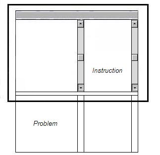
We think that solutions with parallel viewports with one or two scrollbars is the best; as the majority of the participants says. Figure 4 shows the basic concept of that design. But also, if people use scrollbars correctly, long web-pages with vertical scrollbars may be the next best design for task-oriented web-based environments.

Figure 4. The best design for learning-, working- and doing environments, if there is a concrete task and a lot of parallel information is required, is an interface with two viewports (frames), mostly with two scrollbars.
In the response times we did not find significant differences between the designs. Only in control task 5. We know about the scrollbar interface of browsers that before the internet became very popular scrolling was not done in multimedia applications. But nowadays we know an application with scrollbars is not a problem for users; especially not for children.
Response times in this experiment were slightly slower than those in Yu’s experiment in 2002, with parallel instruction on paper. Yu did not compare his results in a statistic way. Most participants do not care much for design B and D. Apparently they don’t like windows that have to be moved or made smaller (minimised). A considerable number like design C as well, even though scrolling is required. Apparently scrolling has become more common in 2004. We never thought that the average response times would be so close together. This may be due to the fact that a lot of thought has been given to all four user interfaces. The assignments were also ‘easy’ to carry out.
A logical continuation of the present experiment is the implementation of a concrete task instead of the present abstract task. We already did one small try-out, focused on a real simulation task. The difference in the two concrete tasks is the data that the subjects have to manipulate are meaningful data within the context of the subjects mental model of the sun boiler or fishing pond. Instead of meaningless numbers as was the case in our experiment. The second relevant difference is that the (parallel) instructions are no longer provided on paper but are integrated on the screen in windows or viewports. The integration of the instructions is expected to highlight the main problem: the lack of space on regular screen sizes that is associated with the type of linearity by current hypermedia. We think that ‘just in place’ information is more profitable to the user in task oriented e-learning environments than only ‘just in time’ information, as some authors claim.
The main problem in abstract tasks is alienation of the task from the context. The cognitive load in concrete tasks is often much higher because of the contextual information that has to be processed.
For long periods, we thought that a design with two small overlapping windows, one for the simulator and one with the instruction and other texts, is the best design for very realistic and complex simulations (Min, 2001). User interfaces with viewports score better; even if both documents are long. In that design, all participants work without a higher cognitive load. Design C, which a long webpage and 'virtual parallelism', could in a lot of cases in the future be a winner.
Parallelism and the PI theory, are a useful theory for designing interfaces. It helps the user do his tasks on computer monitors. Parallelism and the cognitive aspects of the PI theory can be good solutions for problems such as small screens and cognitive overload of information. In fact, parallelism does not mean the more information the better, it means that necessary and reliable information is never too much. Maybe the name 'Parallel Information theory' is more suitable. More and more cases show that the PI theory can be applied to many domains, including commercial, industrial and military applications as the experiments of Claessens show (Claessens, 1999).
Problem solving on paper or with a book also works very well. It is parallelism too. Unfortunately, most educational software designers do not realize the importance of parallelism as in old-fashioned paper instruction materials and the need to transfer that way of working to modern media.
References
Chandler, P., & Sweller, J. (1991). Cognitive Load theory and the format of instruction. Cognition and Instruction, Vol. 8, 293-332
Claessens, M. (1999). The effect of different ICT-designs on learning specific tasks; First year report of PhD Study. University of Twente. Project leader R. Min; supervisor J. Moonen. [Online] Available on internet: http://projects.edte.utwente.nl/pi/Papers/indexClaessens.htm.
Joolingen, W.R. van, & de Jong, T. (1996). Design and implementation of simulation-based discovery environments: the SMISLE solution. Journal of Artificial Intelligence and Education, 7, 253-277.
Mayer, R. E., & R.B. Anderson (1991). Animations Need Narrations: An Experimental Test of a Dual-coding Hypothesis. J. of Educ. Psych. Vol. 83, No. 4, 484-490.
Mayer, R. E. & R. Moreno (2000). A Split Attention Effect in Multimedia Learning: Evidence for Dual Processing Systems in Working Memory. J. of Educ. Psych., Vol. 90, No. 2, 312-320.
Min, R., (1992) Parallel Instruction, a theory for Educational Computer Simulation. Interactive Learning International, Vol. 8, No. 3, 177-183.
Min, R. (1994). Parallelism in open learning and working environments. Britsh Journal of Educational Technology, Vol. 25, No. 2, 108-112. ISSN 0007-1013.
Min, R. (1996). Parallelism and the Parallel Instruction Theory. [Online] Available via the World Wide Web at http://users.edte.utwente.nl/min/home/Theory2.htm.
Min, R. (2001). Simulation and discovery learning in an age of zapping and searching; a treatise about the educational strength and availability of digital learning tools and simulation on the World Wide Web. [Online] Available on the World Wide Web at http://projects.edte.utwente.nl/pi/Papers/DiscLearning.html.
Min, R. and Yu, T. (2003). e-Learning Environments on the world wide web, based on the Concept of Parallelism (empirical study with abstract and concrete tasks based on simulation experiences). (non-published pre-paper) EARLI 2003 conference Padova, Italy, August 26 - 30, 2003. ISBN 88.7178.975.X. Online available on internet: http://projects.edte.utwente.nl/pi/Papers/YuOld.html.
Moreno, R., & R.E. Mayer (2000). A coherence Effect in multimedia learning: the case for minimizing irrelevant sounds in the design of multimedia instructional messages. J. of Educ. Psychology, Vol. 92, No. 1, 117-125.
Mousavi, S. Y., Low, R., & Sweller, J. (1995). Reducing cognitive load by mixing auditory and visual presentation modes. Journal of Educational Psychology, Vol. 87, No. 2, 319-334
Sweller, J. (1988). Cognitive load during problem solving: Effects on learning. Cognitive Science, Vol. 12, 257-285.
Sweller, J., van Merrienboer, J. J. G., & Paas, F. G. W. C. (1998). Cognitive Architecture and Instructional Design. Educational Psychological Review, Vol. 10, No. 3, 251-296.
Schaick Zillesen, P.G. van (1990) Methods and techniques for the design of educational computer simulation programs and their validation by means of empirical research. PhD. thesis, University of Twente, Enschede, Holland (promotors: E. Warries and R. Min).
Yu, T. (2002). Empirical study to Cognitive Load and the PI theory with well-designed products for procedure skills and parallel instructions. Master Thesis, University of Twente. Enschede. R. Min: project leader and designer; J. Moonen: supervisor. Online available on internet: http://projects.edte.utwente.nl/pi/Papers/indexYu.html.
First version March, 2003; last version May 2004.
